Montant total (1 article articles) :
Destination de la commande :

doesburg théo kurt schwitters (11 résultats)
Passer aux résultats principaux de la recherche
Type d'article
- Tous les types d'articles
- Livres (11)
- Magazines & Périodiques
- Bandes dessinées
- Partitions de musique
- Art, Affiches et Gravures
- Photographies
- Cartes
-
Manuscrits &
Papiers anciens
Etat
- Tous
- Neuf
- Ancien ou d'occasion
Reliure
Particularités
- Edition originale (3)
- Signé (1)
- Jaquette (1)
- Avec images (8)
- Sans impression ŕ la demande
Pays
Evaluation du vendeur
-
Art and Anti Art A Dada Collection Rosa Esman Gallery 1990 Exhibition invite postcard
Edité par Rosa Esman Gallery, 1990
Exhibition invite, 6 x 6 inches; very good condition; a mailed copy with address and postal marks on rear.
-
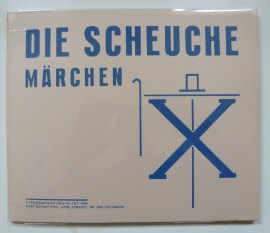
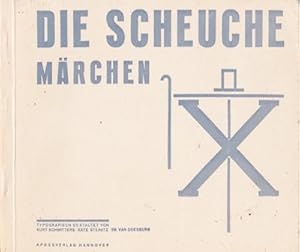
Die Scheuche - Märchen - Typographisch gestaltet von Kurt Schwitters Kate Traumann Steinitz Th. Van Doesburg.
Edité par Alkmaar Fizz-Subvers Press Dada-Bibliotheek Boek 5 Facsimile reprint of the original edition published by Hannover Aposs Verlag, 1925
Etat : In good condition. Pap., stapled, 16.5 x 19 cms, unpaginated, printed in red and blue. Epilogue (in Dutch) by Erik Slagter. Edtion of 1,000 copies.
-

Zu Gast bei Kate T.Steinitz. The Guestbook of Kate T.Sienitz.
Edité par Galerie Gmurzynska, Köln ., 1977
Vendeur : Galerie Buchholz OHG (Antiquariat), Köln, Allemagne
Membre d'association : BVDG ILAB VDA
Evaluation du vendeur :

Edition originale
Hardcover. Etat : Good. 166 S., zahlr. Abb., OPp., 27,5 x 23 cm. Reprographischer Nachdruck des Gästebuches von Kate T. Steinitz aus den Jahren 1921 - 1960. Einleitung auf Deutsch und Englisch von Werner Krüger. Außen berieben u. leicht fleckig, darüber hinaus in guter Erhaltung.
-
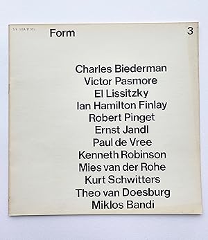
Form issue 3
Edité par Cambridge, 1966
Vendeur : William Allen Word & Image, London, Royaume-Uni
Evaluation du vendeur :

Etat : Near Fine. 240 x 240 mm. 32pp. Printed black and white, stapled. Issue 3 of the most significant British magazine of the 60s concentrating on pure abstraction and through this art theory, avant-garde magazines et al. This issue features 'G' with work by Kurt Schwitters, Theo van Doesburg, Mies van der Rohe, Miklos Bandi, Charles Biederman, Victor Pasmore, El Lissitzky, Ian Hamilton Finlay, Robert Binget, Ernst Jandl, Paul de Vree, Kenneth Robinson. Condition: minor toning to covers, otherwise no markings or tears, near fine.
-
Die Scheuche X. Märchen.
Edité par frankfurt am main, verlag biermann + boukes, 1971
Vendeur : Klaus Kuhn Antiquariat Leseflügel, Köln, NRW, Allemagne
Evaluation du vendeur :
Livre
12 typographisch gestaltete Seiten in Blau und Rot, ohne Seitenzahlen, Zustand: erstklassiges, neuwertiges Exemplar. Trotz des Reprints ein äußerst seltenes Sammlerstück. Wunderbar schräge Texte zu spannungsvoller Typographie! Auf der Rückseite wird für Abos der Zeitschriften De Stijl und Merz geworben. Sprache: Deutsch Gewicht in Gramm: 550 20,0 x 24,0 cm, Broschiert mit schwarzem Leinenfälzel Reprint nach dem Original das 1925 im Apossverlag in Hannover erschienen ist,.
-
Een rumoerige Soirée ; Dada in de Residentie. [Eerte druk; First edition].
Vendeur : Antiquarianbooksellers GEMILANG, Bredevoort, Pays-Bas
Evaluation du vendeur :

Haarlem, Carline Pers [C.J. van Dijk], 1973. Large 8°. Original purple cloth, Narrow white tile label on spine. [2pp. blank], Hftitle (verso blank), 28; [1p., blank]. Copy set and printed by hand. Ti.-p. in capital blue bold typography, further typography in Dada style advanced experimental typography in five colours. Colophon. Page 7 has been puposedly left blank as a challenge to the reader to be decorated. Limited edition of 110 copies only, this copy bears nr. 43. This dutch language publication by the "CarlinaPers", Haarlem municipality, is a truthfull reflection of an essay about the Dada movement, published in a dutch daily "De Telegraaf", january 11, 1923, by which a Dada performance has been reported. Copy printed in Dada advanced experimental typography in 5 different colours. Very fine copy. Scarce.
-
Die Scheuche. Marchen X / typografisch gestaltet von Kurt Schwitters.
Edité par Gallery Samlaren, 1965
Vendeur : studio montespecchio, Montespecchio, Italie
Membre d'association : ALAI ILAB
Evaluation du vendeur :
Livre Signé
Soft cover. Etat : Fine. Small oblong octavo, un paginated (12 pages), illustrated throughout. Illustrated wrappers. - Miniature reprint of the 1925 Aposs edition. This copy signed in red pencil by Kate Steinitz. Loosely laid in a holograph English translation by Robert Haas. Kate Steinitz flees in from the Pre-Hitlerian atmosphere to New York City. Later, art studies continue, exhibitions in New York Public Library branches. Arranges 'Great Americans' art exhibit at 1939 World's Fair. She moves in 1942 to California to join daughters. In 1943 meets Elmer Belt, M.D. 'I was sick, but not aware that my ailment, a kidneystone, was, in fact, my greatest capital. It brought me to Dr. Elmer Belt in Los Angeles, as a patient; ultimately, it made me a Vincian librarian. When I saw, for the first time, the beginning of Dr. Belt's Leonardo da Vinci's Library beautifully housed on the built-in shelves in his office, I forgot my ailments.' 1942-1961 Becomes librarian of Dr. Belt?s collection. Publications on da Vinci, work on da Vinci exhibitions. Expansion of the library. Signed by Author(s).
-
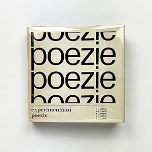
experimentální poezie
Edité par Odeon, Prague, 1967
Vendeur : The Idea of the Book, Portland, OR, Etats-Unis
Evaluation du vendeur :
Edition originale
First edition. Square hardcover 8vo bound in white cloth foil stamped in black and green at front cover and spine. With front endpapers printed in green, pages mostly printed in black, some in black and green, and a gatefold at rear endpaper. Housed in dust jacket printed in black and green. 265 pp. Text mostly in Czech, some French, English, and German. Artists' book in the form of an international anthology of experimental, visual, and concrete poetry. With contributions by Pierre Albert-Birot, Guillaume Apollinaire, Alain Arias-Misson, Konrad Bayer, Carlo Belloli, Max Bense, Mirella Bentivoglio, Jean-François Bory, Edgard Braga, Claus Bremer, Augusto de Campos, Haroldo de Campos, Ugo Carrega, Henri Chopin, Bob Cobbing, Theo van Doesburg, Paul de Vree, Herman de Vries, Reinhard Döhl, Öyvind Fahlström, Heinz Gappmayr, Pierre Garnier, Mathias Goeritz, Eugen Gomringer, Bohumila Grögerová, Isidore Isou, José Lino Grünewald, Ian Hamilton Finlay, Yasuo Fujitomi, Raoul Hausmann, Dick Higgins, Josef Hirsal, Dom Sylvester Houédard, Ernst Jandl, Hiro Kamimura, Katué Kitasono, Jirí Kolár, Ferdinand Kriwet, Maurice Lemaître, Arrigo Lora-Totino, Stéphane Mallarmé, Filippo Tommaso Marinetti, Hansjörg Mayer, Franz Mon, Edwin Morgan, Maurizio Nannucci, Seiichi Niikuni, bp Nichol, Ladislav Novák, Décio Pignatari, Diter Rot (Dieter Roth), Gerhard Rühm, Aram Saroyan, Kurt Schwitters, Edward Lucie Smith, Mary Ellen Solt, Adriano Spatola, Vagn Steen, Shohachiro Takahashi, André Thomkins, Timm Ulrichs, Milos Urbásek, Wolf Vostell, and Emmett Williams among others. Includes an introduction by Milos Juzl. Book design by Czech designer and typographer Oldrich Hlavsa, whose understanding of the movement is evident through the design of the book which is approached as a work concrete poetry in its own right. One of our most favorite visual and concrete poetry anthologies. Book with trace amounts of rubbing and light bowing to boards, previous owner's bookplate affixed to inside left cover, including a small stain at upper margin which has created a small area of ink loss to the green endpapers and first page, a few pages with light diagonal fold lines at upper right tips, and trace amounts of age toning to pages. Very good. Dust jacket now housed in a mylar jacket with trace amounts of age toning, faint spotting, and a few small closed tears along margins. Very good.
-
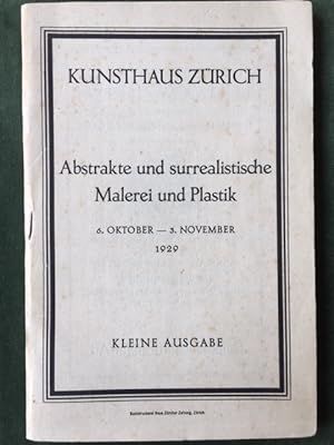
ABSTRAKTE UND SURREALISTISCHE MALEREI UND PLASTIK - 6. oktober - 3 november 1929. Kunsthaus Zürich.
Date d'édition : 1929
Couverture souple. Etat : Bon. 6. oktober - 3 november 1929. Kunsthaus Zürich. Kleine ausgabe. Un catalogue au format 135x205mm. 40 pages. Catalogue a prix marqués d oeuvres de : Josef ALBERS, Hans ARP, Willi BAUMEISTER, Constantin BRANCUSI, Georges BRAQUE, Giorgio de CHIRICO, Salvador DALI, Robert DELAUNAY, Theo van DOESBURG, Max ERNST, Otto FREUNDLICH, Juan GRIS, Wassily KANDINSKY, Paul KLEE, Fernand LEGER, Jacques LIPSCHITZ, EL LISSITZKY, René MAGRITTE, Kasimir MALEWITSCH, MAN RAY, Louis MARCOUSSIS, André MASSON, Otto MEYER-AMDEN, Joan MIRO, Laszlo MOHOLY-NAGY, Piet MONDRIAN, Amédée OZENFANT, Antoine PEVSNER, Francis PICABIA, Pablo PICASSO, SAVITRY, Kurt SCHWITTERS, Gino SEVERINI, SIMA, Yves TANGUY, José de TOGORES, Joaquin TORRES-GARCIA, Georges VALMIER, Georges VANTONGERLOO, Friedrich VORDEMBERGE-GILDEWART. Légčres rousseurs sur la couverture. (MODERNISME - CATALOGUE D EXPOSITION - AVANT-GARDE - SURREALISME - SURREALISM - ART ABSTRAIT - ABSTRACT ART - BAUHAUS).
-
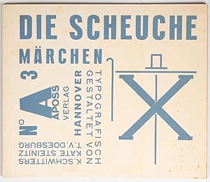
Die Scheuche. Märchen.
Edité par Apossverlag, Hannover, 1925
Vendeur : Antiquariat Heinz Rohlmann, Köln, Allemagne
Membre d'association : ILAB VDA
Evaluation du vendeur :
Livre Edition originale
Softcover. Etat : Sehr gut. 1. Auflage. (12) pages printed in red and blue. 20,5 x 24,5 cm. Typographically designed original brochure. First edition. Part of the book edition was later labelled Merz 14/15 by Schwitters with a strip of paper glued on. Three different designs of the front cover are known. Two variants are described in the subtitle as Märchen , one variant of which also contains the inscription Aposs NO 3 Hannover turned 90 degrees anti-clockwise, as here in the offered copy. In the third variant, the artists eliminated the designation Märchen and replaced it with the printed designation Merz 14/15 , which can be traced back to a later inclusion in the Merz series. With Die Scheuche , Schwitters and Steinitz created a purely typographic picture book that dispenses with any drawings and uses purely typographic elements for the illustrations. Kurt knew the typesetter Paul Vogt, who liked to play around with new typographic ideas in a small print shop. He let us run wild, was happy to cut the extra-large O we needed for Monsieur le Coq, the cockerel, and did not refuse, as any normal typesetter would have done, to set the small b as the peasant s feet diagonally and the capital B completely diagonally for the angry peasant. Quoted from: Schelle, Der Typograph Kurt Schwitters A 16, Hannover 1987.
-
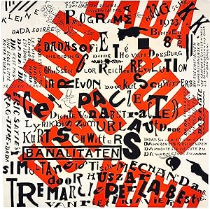
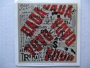
kleine dada soirée.
Edité par (1922 / 1923)., (The Hague)., 1922
Vendeur : Sims Reed Ltd ABA ILAB, London, Royaume-Uni
Membre d'association : ABA ILAB
Evaluation du vendeur :
Livre
(300 x 300 mm). Lithograph in red with additional printing in black recto only on thin newsprint paper, the full sheet, never folded; sheet size: 300 x 300 mm. An excellent example, never folded, of the first issue of the iconic 'kleine dada soirée' poster. This programme / poster by Théo van Doesburg and Kurt Schwitters details the events for the travelling show they had devised towards the end of 1922. Their proposed tour of Holland was to start in The Hague in December 1922 but had to be postponed due to problems with Schwitters' passport. On January 10th, 1923, Schwitters and van Doesburg appeared at the Haagsche Kunstkring (the details are at the upper right of the poster together with the address 'Binnenhof 8') and the performance featured van Doesburg's 'dadasofie', 'ragtime-dada' by Erik Satie and Schwitters' sound poetry. The chaotic typography of the poster, in typical dada style, features random capitalisations, variations in typography, the text at variable and peculiar angles, manicules, small vignettes, a quotation from Tristan Tzara etc., all against a background with 'dada' printed in red. 'DADA EXISTE DEPUIS / TOUJOURS LA SAINTE / VIERGE DÉJŔ FUT / DADAĎSTE'. (From the poster). It is thought that Piet Zwart, a member of the Kunstkring attended that first performance, and over the following three months a further 13 performances were held in different cities. The basic form for each event included van Doesburg reading from his booklet 'Wat ist Dada?', Schwitters making animal noises (barking like a dog or cooing like a dove) from the audience before reading his own works, van Doesburg's wife Nelly - she appeared under the stage name 'Pétro' - would play musical selections and the fourth collaborator, Vilmos Huszár, projected on a screen the moving figure of a mechanical dancer. 'We opened in den Haag in Konstruktixistik manner. Doesburg read a very good dadaistic programme, in which he said the dadaist would do something unexpected. At that moment I rose from the middle of the publik and barked loud. Some people fainted, and were carried out, and the Papers reported that Dada means barking.' (Schwitters quoted in Dada and Surrealism Reviewed). A second issue of the poster was produced later with the address at upper right ('Haagsche K[unst]. K[ring]. / Binnenhof 8') replaced with details of a subscription for van Doesburg's 'Mécano': 'Abonnement Mécano 5 Fr. per Jaar'. 'DADA EST CONTRE / LE FUTUR DADA / EST MORT DADA / EST IDIOT, VIVE / DADA! DA / DA N'EST PAS / UNE ÉCOLE LITTÉ / RAIRE HURLE. / TRISTAN TZARA'. (From the poster). 'The poster / program 'Small Dada Evening' is a carefully orchestrated visual cacophony. Information is difficult to discern in this nonhierarchical [sic] composition of red and black lettering distributed pell-mell across the white page. The work was printed in two passes through the press . 'Small Dada Evening' is a tricky piece of graphic design, a playful tease falling somewhere between communication and Dadaist self-subversion. The sheet doubles as a poster advertising the Dada Soirées that toured Holland in 1923 and as a program for the Soirées' proceedings, but even while it claims these dual functions, it undermines them . 'Small Dada Evening' is not a poster in the traditional sense. It may be better understood as a visual emblem of the Dutch Dada tour, a graphic encapsulation of the soirées and of Van Doesburg's and Schwitters' particular brands of Dada.' (Christian Larsen). [see 'Dada in the Collection of the Museum of Modern Art', New York, 2008, pp. 102 - 105; see Ades pp. 125 - 126 which describes the series of 'kleine dada soirée' performances (but without naming them) in Schwitters' words].