
Articles liés à Just My Type: A Book About Fonts
Synopsis
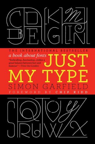
A hugely entertaining and revealing guide to the history of type that asks, What does your favorite font say about you?
Fonts surround us every day, on street signs and buildings, on movie posters and books, and on just about every product we buy. But where do fonts come from, and why do we need so many? Who is responsible for the staid practicality of Times New Roman, the cool anonymity of Arial, or the irritating levity of Comic Sans (and the movement to ban it)?
Typefaces are now 560 years old, but we barely knew their names until about twenty years ago when the pull-down font menus on our first computers made us all the gods of type. Beginning in the early days of Gutenberg and ending with the most adventurous digital fonts, Simon Garfield explores the rich history and subtle powers of type. He goes on to investigate a range of modern mysteries, including how Helvetica took over the world, what inspires the seeming ubiquitous use of Trajan on bad movie posters, and exactly why the all-type cover of Men are from Mars, Women are from Venus was so effective. It also examines why the "T" in the Beatles logo is longer than the other letters and how Gotham helped Barack Obama into the White House. A must-have book for the design conscious, Just My Type's cheeky irreverence will also charm everyone who loved Eats, Shoots & Leaves and Schott's Original Miscellany.
Les informations fournies dans la section « Synopsis » peuvent faire référence à une autre édition de ce titre.
À propos de l'auteur
Simon Garfield is the author of twelve acclaimed books of nonfiction. He lives in London and St. Ives, Cornwall, and currently has a soft spot for Requiem Fine Roman and HT Gelateria.
Les informations fournies dans la section « A propos du livre » peuvent faire référence à une autre édition de ce titre.
Résultats de recherche pour Just My Type: A Book About Fonts

Image d'archives
Just My Type: A Book about Fonts
Edité par
Gotham Books, 2011
ISBN 10 : 1592406521
ISBN 13 : 9781592406524
Ancien ou d'occasion
Couverture rigide
Vendeur : World of Books (was SecondSale), Montgomery, IL, Etats-Unis
Évaluation du vendeur 5 sur 5 étoiles

Hardback. Etat : Very Good. A delightfully inquisitive tour that explores the rich history and the subtle powers of fonts.Fonts surround us every day, on street signs and buildings, on movie posters and books, and on just about every product that we buy. But where do fonts come from and why do we need so many? Who is behind the businesslike subtlety of Times New Roman, the cool detachment of Arial, or the maddening lightness of Comic Sans (and the movement to ban it)? Simon Garfield embarks on a mission to answer these questions and more, and reveal what may be the very best and worst fonts in the world.Typefaces are now 560 years old, but we barely knew their names until about twenty years ago, when the pull-down font menus on our first computers made us all the gods of type. Beginning in the early days of Gutenberg and ending with the most adventurous digital fonts, Garfield unravels our age old obsession with the way our words look. Just My Type investigates a range of modern mysteries, including how Helvetica took over the world, what inspires the seemingly ubiquitous use of Trajan on bad movie posters, and what makes a font look presidential, male or female, American, British, German, or Jewish. From the typeface of Beatlemania to the graphic vision of the Obama campaign, fonts can signal a musical revolution or the rise of an American president. This book is a must-read for the design conscious that will forever change the way you look at the printed word. N° de réf. du vendeur CIN1592406521VG
Acheter D'occasion
EUR 4,05
Livraison gratuite
Expédition nationale : Etats-Unis
Expédition nationale : Etats-Unis
Quantité disponible : 1 disponible(s)
Image d'archives
Just My Type: A Book about Fonts
Edité par
Gotham Books, 2011
ISBN 10 : 1592406521
ISBN 13 : 9781592406524
Ancien ou d'occasion
Couverture rigide
Vendeur : World of Books (was SecondSale), Montgomery, IL, Etats-Unis
Évaluation du vendeur 5 sur 5 étoiles
Hardback. Etat : Good. A delightfully inquisitive tour that explores the rich history and the subtle powers of fonts.Fonts surround us every day, on street signs and buildings, on movie posters and books, and on just about every product that we buy. But where do fonts come from and why do we need so many? Who is behind the businesslike subtlety of Times New Roman, the cool detachment of Arial, or the maddening lightness of Comic Sans (and the movement to ban it)? Simon Garfield embarks on a mission to answer these questions and more, and reveal what may be the very best and worst fonts in the world.Typefaces are now 560 years old, but we barely knew their names until about twenty years ago, when the pull-down font menus on our first computers made us all the gods of type. Beginning in the early days of Gutenberg and ending with the most adventurous digital fonts, Garfield unravels our age old obsession with the way our words look. Just My Type investigates a range of modern mysteries, including how Helvetica took over the world, what inspires the seemingly ubiquitous use of Trajan on bad movie posters, and what makes a font look presidential, male or female, American, British, German, or Jewish. From the typeface of Beatlemania to the graphic vision of the Obama campaign, fonts can signal a musical revolution or the rise of an American president. This book is a must-read for the design conscious that will forever change the way you look at the printed word. N° de réf. du vendeur 00102217965
Acheter D'occasion
EUR 4,05
Livraison gratuite
Expédition nationale : Etats-Unis
Expédition nationale : Etats-Unis
Quantité disponible : 12 disponible(s)
Image fournie par le vendeur
Just My Type: A Book About Fonts
Edité par
Gotham, 2011
ISBN 10 : 1592406521
ISBN 13 : 9781592406524
Ancien ou d'occasion
Couverture rigide
Vendeur : Zoom Books East, Glendale Heights, IL, Etats-Unis
Évaluation du vendeur 5 sur 5 étoiles
Etat : good. Book is in good condition and may include underlining highlighting and minimal wear. The book can also include "From the library of" labels. May not contain miscellaneous items toys, dvds, etc. . We offer 100% money back guarantee and 24 7 customer service. N° de réf. du vendeur ZEV.1592406521.G
Acheter D'occasion
EUR 4,06
Livraison gratuite
Expédition nationale : Etats-Unis
Expédition nationale : Etats-Unis
Quantité disponible : 1 disponible(s)
Image fournie par le vendeur
Just My Type: A Book About Fonts
Edité par
Gotham, 2011
ISBN 10 : 1592406521
ISBN 13 : 9781592406524
Ancien ou d'occasion
Couverture rigide
Vendeur : Zoom Books Company, Lynden, WA, Etats-Unis
Évaluation du vendeur 5 sur 5 étoiles
Etat : very_good. Book is in very good condition and may include minimal underlining highlighting. The book can also include "From the library of" labels. May not contain miscellaneous items toys, dvds, etc. . We offer 100% money back guarantee and 24 7 customer service. N° de réf. du vendeur ZBV.1592406521.VG
Acheter D'occasion
EUR 4,06
Livraison gratuite
Expédition nationale : Etats-Unis
Expédition nationale : Etats-Unis
Quantité disponible : 1 disponible(s)
Image fournie par le vendeur
Just My Type: A Book About Fonts
Edité par
Gotham, 2011
ISBN 10 : 1592406521
ISBN 13 : 9781592406524
Ancien ou d'occasion
Couverture rigide
Vendeur : Greenworld Books, Arlington, TX, Etats-Unis
Évaluation du vendeur 5 sur 5 étoiles
Etat : very_good. Fast Free Shipping â" Very Good condition book with a firm cover and clean pages. Shows normal use and some light wear or limited notes markings. A solid, nice copy to enjoy. N° de réf. du vendeur GWV.1592406521.VG
Acheter D'occasion
EUR 4,70
Livraison gratuite
Expédition nationale : Etats-Unis
Expédition nationale : Etats-Unis
Quantité disponible : 1 disponible(s)
Image d'archives
Just My Type: A Book About Fonts
Edité par
Gotham, 2011
ISBN 10 : 1592406521
ISBN 13 : 9781592406524
Ancien ou d'occasion
Couverture rigide
Vendeur : More Than Words, Waltham, MA, Etats-Unis
Évaluation du vendeur 5 sur 5 étoiles
Etat : Very Good. A bright, square, and overall a nice copy. N° de réf. du vendeur BOS-D-04f-02144
Acheter D'occasion
EUR 1,16
Expédition à EUR 3,56
Expédition nationale : Etats-Unis
Expédition nationale : Etats-Unis
Quantité disponible : 1 disponible(s)
Image d'archives
Just My Type: A Book About Fonts
Edité par
Gotham, 2011
ISBN 10 : 1592406521
ISBN 13 : 9781592406524
Ancien ou d'occasion
Couverture rigide
Vendeur : New Legacy Books, Annandale, NJ, Etats-Unis
Évaluation du vendeur 5 sur 5 étoiles
hardcover. Etat : Very Good. Fast shipping and order satisfaction guaranteed. A portion of your purchase benefits Non-Profit Organizations, First Aid and Fire Stations! N° de réf. du vendeur mon0000185593
Acheter D'occasion
EUR 2,75
Expédition à EUR 2,22
Expédition nationale : Etats-Unis
Expédition nationale : Etats-Unis
Quantité disponible : 1 disponible(s)
Image fournie par le vendeur
Just My Type: A Book About Fonts
Edité par
Gotham, 2011
ISBN 10 : 1592406521
ISBN 13 : 9781592406524
Ancien ou d'occasion
Couverture rigide
Vendeur : Dream Books Co., Denver, CO, Etats-Unis
Évaluation du vendeur 5 sur 5 étoiles
Etat : good. Gently used with minimal wear on the corners and cover. A few pages may contain light highlighting or writing, but the text remains fully legible. Dust jacket may be missing, and supplemental materials like CDs or codes may not be included. May be ex-library with library markings. Ships promptly! N° de réf. du vendeur DBV.1592406521.G
Acheter D'occasion
EUR 5,18
Livraison gratuite
Expédition nationale : Etats-Unis
Expédition nationale : Etats-Unis
Quantité disponible : 1 disponible(s)
Image d'archives
Just My Type: A Book about Fonts
Edité par
Gotham Books, 2011
ISBN 10 : 1592406521
ISBN 13 : 9781592406524
Ancien ou d'occasion
Couverture rigide
Vendeur : World of Books Inc, Montgomery, IL, Etats-Unis
Évaluation du vendeur 4 sur 5 étoiles

Hardback. Etat : Very Good. A delightfully inquisitive tour that explores the rich history and the subtle powers of fonts.Fonts surround us every day, on street signs and buildings, on movie posters and books, and on just about every product that we buy. But where do fonts come from and why do we need so many? Who is behind the businesslike subtlety of Times New Roman, the cool detachment of Arial, or the maddening lightness of Comic Sans (and the movement to ban it)? Simon Garfield embarks on a mission to answer these questions and more, and reveal what may be the very best and worst fonts in the world.Typefaces are now 560 years old, but we barely knew their names until about twenty years ago, when the pull-down font menus on our first computers made us all the gods of type. Beginning in the early days of Gutenberg and ending with the most adventurous digital fonts, Garfield unravels our age old obsession with the way our words look. Just My Type investigates a range of modern mysteries, including how Helvetica took over the world, what inspires the seemingly ubiquitous use of Trajan on bad movie posters, and what makes a font look presidential, male or female, American, British, German, or Jewish. From the typeface of Beatlemania to the graphic vision of the Obama campaign, fonts can signal a musical revolution or the rise of an American president. This book is a must-read for the design conscious that will forever change the way you look at the printed word. N° de réf. du vendeur CIN1592406521VG
Acheter D'occasion
EUR 5,89
Livraison gratuite
Expédition nationale : Etats-Unis
Expédition nationale : Etats-Unis
Quantité disponible : 1 disponible(s)
Image d'archives
Just My Type: A Book about Fonts
Edité par
Gotham Books, 2011
ISBN 10 : 1592406521
ISBN 13 : 9781592406524
Ancien ou d'occasion
Couverture rigide
Vendeur : World of Books Inc, Montgomery, IL, Etats-Unis
Évaluation du vendeur 4 sur 5 étoiles
Hardback. Etat : Good. A delightfully inquisitive tour that explores the rich history and the subtle powers of fonts.Fonts surround us every day, on street signs and buildings, on movie posters and books, and on just about every product that we buy. But where do fonts come from and why do we need so many? Who is behind the businesslike subtlety of Times New Roman, the cool detachment of Arial, or the maddening lightness of Comic Sans (and the movement to ban it)? Simon Garfield embarks on a mission to answer these questions and more, and reveal what may be the very best and worst fonts in the world.Typefaces are now 560 years old, but we barely knew their names until about twenty years ago, when the pull-down font menus on our first computers made us all the gods of type. Beginning in the early days of Gutenberg and ending with the most adventurous digital fonts, Garfield unravels our age old obsession with the way our words look. Just My Type investigates a range of modern mysteries, including how Helvetica took over the world, what inspires the seemingly ubiquitous use of Trajan on bad movie posters, and what makes a font look presidential, male or female, American, British, German, or Jewish. From the typeface of Beatlemania to the graphic vision of the Obama campaign, fonts can signal a musical revolution or the rise of an American president. This book is a must-read for the design conscious that will forever change the way you look at the printed word. N° de réf. du vendeur CIN1592406521G
Acheter D'occasion
EUR 5,89
Livraison gratuite
Expédition nationale : Etats-Unis
Expédition nationale : Etats-Unis
Quantité disponible : 12 disponible(s)