Synopsis
Typography, Referenced was named to the 2013 Outstanding Reference Sources List, an annual handpicked list from the Reference and User Services Association (RUSA, a division of the American Library Association) of the most noteworthy reference titles published in 2012.
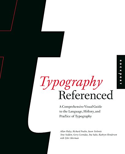
Typography, Referenced is the single most comprehensive volume covering every aspect of typography that any design student, professional designer, or design aficionado needs to know today.
In these pages, you'll find:
—Thousands of illustrated examples of contemporary usage in design
—Historical developments from Greek lapidary letters to the movie Helvetica
—Landmark designs turning single letters into typefaces
—Definitions of essential type-specific language, terms, ideas, principles, and processes
—Ways technology has influenced and advanced type
—The future of type on the web, mobile devices, tablets, and beyond
In short, Typography, Referenced is the ultimate source of typographic information and inspiration, documenting and chronicling the full scope of essential typographic knowledge and design from the beginnings of moveable type to the present "golden age" of typography.
Les informations fournies dans la section ę Synopsis Ľ peuvent faire rťfťrence ŗ une autre ťdition de ce titre.
ņ propos de l'auteur
Jason Tselentis teaches graphic design and typography at Winthrop University in Rock Hill, South Carolina. He is the author of Type, Form, and Function by Rockport Publishers.
Allan Haley is Director of Words & Letters at Monotype Imaging, based in Woburn, Massachusetts. He is responsible for strategic planning and creative implementation of just about everything related to typeface designs, and editorial content for the company’s type libraries and websites.
Richard Poulin is design director and principal of Poulin + Morris Inc., in New York City. He is a faculty member at the School of Visual Arts, and he is the author of The Language of Graphic Design by Rockport Publishers.
Tony Seddon is a designer living in Alfriston, East Sussex, UK. He has written three books: Images: A Creative Digital Workflow for Graphic Designers, Graphic Design for Nondesigners, and Art Directing Projects for Print.
Gerry Leonidas is a Senior Lecturer in Typography at the University of Reading, UK. He teaches typographic design and typeface design at under- and postgraduate levels.
Ina Saltz is an art director, designer, and author of numerous articles on design and typography. She is the author of Typography Essentials by Rockport Publishers. She lives in New York City.
Kathryn Henderson is a writer, editor, and designer interested in the convergence between design and pop culture. Currently, you can find her at Pentagram Design obsessing over new design work and assisting with daily communications as deputy editor of Content Development for http://www.pentagram.com. She resides in Brooklyn, NY.
Tyler Alterman is a fourth-year student in The City University of New York's Macaulay Honors College studying creative behavior change. His obsessions include the science of persuasion, cognitive neuroscience, graphic design, cinnamon pita chips, and any fine type with high contrast, ball terminals, or geometric forms. He lives in New York City.
Extrait. © Reproduit sur autorisation. Tous droits rťservťs.
The Language of Letters
Typeface design, type design, or font design? Letter or glyph? Letterform, perhaps? Designers often use terms interchangeably, but it is helpful to have a good grasp of the nuances, if only because they reveal different aspects of the design process.
Think of a word. A sequence of letters should spring to mind. Write that sequence on a sheet of paper and these letters assume a concrete form made manually: They have been translated into letterforms. Any representations of letters made manually, regardless of the tool and the scale, are letterforms. Their maker controls their sequence and size and knows the dimensions and properties of the surface on which they are rendered. A hasty shopping list, Trajan’s column, John Downer’s brush-made signs. They’re all meaningful collections of letterforms.
On the other hand, any representation of letters intended for mechanical reproduction is a collection of typeforms. The sequence in which a user places them and the size he or she will use remains unknown at the time of their making. Their maker also cannot predict the specifics of their rendering environment. Crucially, typeforms represent formal relationships in two dimensions rather than a specific way of capturing and rendering a shape. In other words, a Univers lowercase a is a Univers lowercase a regardless of the type-making and typesetting technology. Although there are differences in the visible forms produced with handset, hot-metal, and digital type, for example, the differences reflect the influence of the encoding and rendering technology. In other words, a typeface is a snapshot of the designer’s intentions for a collection of typeforms.
To use these shapes in a specific typesetting environment, the typeforms get converted into glyphs (the term for digital formats), precise encodings in a machine-readable language enriched with information about the space surrounding the shape, its relationship to other glyphs, and its behavior. This machine-specific implementation of a typeface is called a font. To return to our Univers example, the typeface can be represented by a Linotype matrix or bits in an OpenType font, but the essence of the design survives, hopefully with fidelity to the designer’s intentions. Typeface design and font making are nominally sequential processes, even if design today closely interweaves typeface design and font production. One person may embody both roles, but often the typeface designer and font maker are separate members of the same team.
Les informations fournies dans la section ę A propos du livre Ľ peuvent faire rťfťrence ŗ une autre ťdition de ce titre.
Rťsultats de recherche pour Typography, Referenced

Image d'archives
Typography, Referenced : A Comprehensive Visual Guide to the Language, History, and Practice of Typography
Editť par
Quarto Publishing Group USA, 2012
ISBN 10 : 1592537022
ISBN 13 : 9781592537020
Ancien ou d'occasion
Couverture rigide
Vendeur : Better World Books, Mishawaka, IN, Etats-Unis
…valuation du vendeur 5 sur 5 ťtoiles
![]()
Etat : Good. Former library copy. Pages intact with minimal writing/highlighting. The binding may be loose and creased. Dust jackets/supplements are not included. Includes library markings. Stock photo provided. Product includes identifying sticker. Better World Books: Buy Books. Do Good. Nį de rťf. du vendeur 39056612-6
Acheter D'occasion
EUR 31,13
Livraison gratuite
Expťdition nationale†: Etats-Unis
Expťdition nationale†: Etats-Unis
Quantitť disponible : 1 disponible(s)
Image d'archives
Typography, Referenced: A Comprehensive Visual Guide to the Language, History, and Practice of Typography
Editť par
Rockport, 2012
ISBN 10 : 1592537022
ISBN 13 : 9781592537020
Ancien ou d'occasion
Couverture rigide
Vendeur : Anybook.com, Lincoln, Royaume-Uni
…valuation du vendeur 5 sur 5 ťtoiles
![]()
Etat : Fair. This is an ex-library book and may have the usual library/used-book markings inside.This book has hardback covers. Clean from markings. In fair condition, suitable as a study copy. No dust jacket. Library sticker on front cover. Please note the Image in this listing is a stock photo and may not match the covers of the actual item,1650grams, ISBN:9781592537020. Nį de rťf. du vendeur 9284726
Acheter D'occasion
EUR 57,58
Expťdition ŗ†EUR 18,26
Expťdition depuis Royaume-Uni vers Etats-Unis
Expťdition depuis Royaume-Uni vers Etats-Unis
Quantitť disponible : 1 disponible(s)
Image d'archives
Typography, Referenced: A Comprehensive Visual Guide to the Language, History, and Practice of Typography
Editť par
Rockport Publishers, 2012
ISBN 10 : 1592537022
ISBN 13 : 9781592537020
Ancien ou d'occasion
Couverture rigide
Vendeur : BOOK OF DAYS, Osaka City, OSAKA, Japon
…valuation du vendeur 4 sur 5 ťtoiles
![]()
Hardcover. Etat : Very Good. Nį de rťf. du vendeur ABE-1632038117118
Acheter D'occasion
EUR 81,38
Expťdition ŗ†EUR 30,72
Expťdition depuis Japon vers Etats-Unis
Expťdition depuis Japon vers Etats-Unis
Quantitť disponible : 1 disponible(s)
Image d'archives
Typography, Referenced: A Comprehensive Visual Guide to the Language, History, and Practice of Typography
Editť par
Rockport Publishers, 2012
ISBN 10 : 1592537022
ISBN 13 : 9781592537020
Ancien ou d'occasion
Couverture rigide
Vendeur : BOOK OF DAYS, Osaka City, OSAKA, Japon
…valuation du vendeur 4 sur 5 ťtoiles
![]()
Hardcover. Etat : Fine. Nį de rťf. du vendeur ABE-1632038072934
Acheter D'occasion
EUR 135,63
Expťdition ŗ†EUR 30,72
Expťdition depuis Japon vers Etats-Unis
Expťdition depuis Japon vers Etats-Unis
Quantitť disponible : 1 disponible(s)
Image d'archives
TYPOGRAPHY REFERENCED: a Comprehensive Visual Guide to the Language, History, and Practice of Typography
Editť par
Rockport Publishers, 2012
ISBN 10 : 1592537022
ISBN 13 : 9781592537020
Neuf
Couverture rigide
Vendeur : BWS BKS, Ferndale, NY, Etats-Unis
…valuation du vendeur 1 sur 5 ťtoiles
![]()
Hardcover. Etat : New. Nį de rťf. du vendeur 97584
Acheter neuf
EUR 1†786,66
Expťdition ŗ†EUR 2,63
Expťdition nationale†: Etats-Unis
Expťdition nationale†: Etats-Unis
Quantitť disponible : 2 disponible(s)