Montant total (1 article articles) :
Destination de la commande :

zapf hermann 1918 2015 (7 résultats)
Commentaires
Passer aux résultats principaux de la recherche
Filtres de recherche
Type d'article
- Tous les types de produits
- Livres (3)
- Magazines & Périodiques (Aucun autre résultat ne correspond ŕ ces critčres)
- Bandes dessinées (Aucun autre résultat ne correspond ŕ ces critčres)
- Partitions de musique (Aucun autre résultat ne correspond ŕ ces critčres)
- Art, Affiches et Gravures (Aucun autre résultat ne correspond ŕ ces critčres)
- Photographies (Aucun autre résultat ne correspond ŕ ces critčres)
- Cartes (Aucun autre résultat ne correspond ŕ ces critčres)
- Manuscrits & Papiers anciens (4)
Etat En savoir plus
- Neuf (Aucun autre résultat ne correspond ŕ ces critčres)
- Comme neuf, Trčs bon ou Bon (2)
- Assez bon ou satisfaisant (4)
- Moyen ou mauvais (Aucun autre résultat ne correspond ŕ ces critčres)
- Conformément ŕ la description (1)
Reliure
- Toutes
- Couverture rigide (Aucun autre résultat ne correspond ŕ ces critčres)
- Couverture souple (2)
Particularités
- Ed. originale (Aucun autre résultat ne correspond ŕ ces critčres)
- Signé (4)
- Jaquette (Aucun autre résultat ne correspond ŕ ces critčres)
- Avec images (6)
- Sans impressions ŕ la demande (7)
Langue (1)
Prix
- Tous les prix
- Moins de EUR 20 (Aucun autre résultat ne correspond ŕ ces critčres)
- EUR 20 ŕ EUR 45
- Plus de EUR 45
Livraison gratuite
- Livraison gratuite ŕ destination de France (Aucun autre résultat ne correspond ŕ ces critčres)
Pays
Evaluation du vendeur
-

SIGNED CARD
Vendeur : Daniel Montemarano, Newfield, NJ, Etats-Unis
Évaluation du vendeur 5 sur 5 étoiles

Signé
EUR 35,14
Autre deviseEUR 36,67 expédition depuis Etats-Unis vers FranceQuantité disponible : 1 disponible(s)
Ajouter au panierUnbound. Etat : Fine. 3 1/2"x 5 3/4" card - SIGNED by Hermann Zapf (signature only). Zapf was a German type designer and calligrapher. Comes with a unsigned B&W photo of Zapf. SIGNED CARD.
-

Manuale typographicum: 100 typographic pages with quotations from the past and present on types and printing.
Edité par Cambridge, Mass.: MIT Press, 1970, 1970
Vendeur : Steven Wolfe Books, Newton Centre, MA, Etats-Unis
Évaluation du vendeur 5 sur 5 étoiles
EUR 109,81
Autre deviseEUR 24,73 expédition depuis Etats-Unis vers FranceQuantité disponible : 1 disponible(s)
Ajouter au panierZapf, Hermann, 1918-2015. Manuale typographicum: 100 typographic pages with quotations from the past and present on types and printing. Cambridge, Mass.: MIT Press, 1970, 123pp., oblong sewn PAPERBACK, cover price label $7.95, good lightly used copy, edges and corners rubbed, previous owner's name in pencil. appears to be SIGNED quite hastily in black marker on front endpaper: Zapf. Cover: 100 typographic pages with quotations from the past and present on types and printing in 16 different languages selected and designed by Hermann Zapf. 9780262740043 ISBN 0262740044.
-
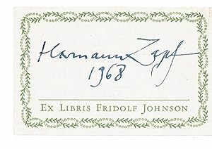
SIGNATURE OF TYPE DESIGNER AND CALLIGRAPHER HERMANN ZAPF ON PRESSMAN FRIDOLF JOHNSON'S BOOK LABEL.
Edité par 1968., 1968
Vendeur : Blue Mountain Books & Manuscripts, Ltd., Cadyville, NY, Etats-Unis
Évaluation du vendeur 5 sur 5 étoiles
Signé
EUR 39,53
Autre deviseEUR 55,22 expédition depuis Etats-Unis vers FranceQuantité disponible : 1 disponible(s)
Ajouter au panierEtat : Fine. - Cream-colored book label, approximately 2 inches high by 3 inches wide, with a decorative green border and "Ex Libris Fridolf Johnson" printed in green along the bottom edge. Signed "Hermann Zapf / 1968" in blue ink. Near fine. Hermann Zapf was a German type designer and calligrapher. Typefaces he designed include Palatina, Optima and Zapfino.
-
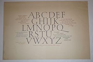
ABCDEFGHIJKLMNOPQRSTUVWXYZ. Original broadside
Edité par Frankfurt/M: 1959, 1959
Vendeur : Wittenborn Art Books, San Francisco, CA, Etats-Unis
Évaluation du vendeur 4 sur 5 étoiles

Manuscrit / Papier ancien
EUR 263,54
Autre deviseEUR 15,35 expédition depuis Etats-Unis vers FranceQuantité disponible : 1 disponible(s)
Ajouter au panierEtat : Good. Letterpress on card stock. 35.5 x52 cm.14" x 19 7/8" broadside. Philip Hofer. Broadside of an Alphabet with quotes by Douglas C McMurtrie, Jean Cocteau and Emanuel Geibel about letters and the alphabet in a variety of languages. Calligraphed by Hermann Zapf and commissioned by Philip Hofer. Printed in 7 colors. The colophon line is in German, and can be translated as "For Philip Hofer in Cambridge, written by Hermann Zapf, Frankfurt am Main 1959". Hermann Zapf (pronounced ?tsáff,? born November 8, 1918) was a German typeface designer who lived in Darmstadt, Germany and was married to calligrapher and typeface designer Gudrun Zapf von Hesse.Zapf's work, which includes Palatino (1948, named after 16th century Italian writing master Giambattista Palatino) and Optima (1952, a flared sans-serif, released by Stempel in 1958. Zapf disliked its name, which was invented by Stempel's marketers), has been widely copied, often against his will. The best known example may be Monotype's Book Antiqua, which shipped with Microsoft Office and was widely considered a ?knockoff? of Palatino. In 1993, Zapf resigned from ATypI (Association Typographique Internationale) over what he viewed as its hypocritical attitude toward unauthorized copying by prominent ATypI members.In 1935, Zapf attended an exhibition in Nuremberg in honor of the late typographer Rudolf Koch. This exhibition gave him his first interest in lettering. Zapf bought two books there, using them to teach himself calligraphy. He also studied examples of calligraphy in the Nuremberg city library. In 1938, Zapf designed his first printed typeface for D. Stempel AG and Linotype GmbH of Frankfurt, a fraktur type called Gilgengart.In 1976, the Rochester Institute of Technology offered Zapf a professorship in typographic computer programming, the first of its kind in the world. He taught there from 1977 to 1987, flying between Darmstadt and Rochester. There he developed his ideas on digital typography further, with the help of his connections in companies such as IBM and Xerox, and his discussions with the computer specialists at RIT. Zapf used his experience to begin development of a typesetting program called the ?hz-program?, which Adobe Systems acquired and later incorporated in their InDesign program.Expertise by: Dominique COURVOISIER,Expert de la Bibliothčque nationale de France. Membre du Syndicat Français des Experts Professionnels en ?uvres d'art5, rue de Miromesnil 75008 Paris.Provenance: from the estate of Raymond Gid who died Sunday November 12, 2000 in Paris. Born on November 25, 1905, Raymond Gid became first known through his posters, after having studied at les Beaux-Arts. As a film enthusiast, he designed many movie posters, for example Vampyr de Dreyer (photomontage, 1932), Le Silence de la mer by Melville (1949), Les Diaboliques by Clouzot (1955). But a meeting with Guy Levis Mano (editions GLM), editor and typographer, soon directed Gid towards the book. In 1935, he publishes, together with the photographer Pierre Jahan Devot Christ de Perpignan and Chats, Chiens by Ylla. It is an intensive period of his life period: he meets Dufy, Corbusier, Hake, Lurcat and receives the gold medal for a poster at the International exhibition of Paris (1937). He reacts to the Civil War in Spain with a poster " Help to the civil populations ". Together With Father Carre, « bete-a-bon-Dieu » of the Resistance, Raymond Gid began to design liturgical texts. Apocalypse Six (an extract of the biblical text of Saint John) appeard after the war. It is one of his major works, composed in the Peignot typeface, which was designed by Cassandre in 1937. He designs several post-war period posters, for example Week of absent, a simple Lorraine cross surrounded by barbed wire on a dark background. Right from the beginning of the symposiums in Lure (Provence) in 1954, Raymond Gid participates in discussions on typography, particularly with Maximilen Vox, Charles Peignot, Roger Excoffon. Raymond Gid puts on page and illustrates the Dialogues of the Carmelite nuns by Bernanos (1954), then some pages in Caractere Noel 1955, dedicated to his friend Jan van Krimpen, the creator of dutch type faces. He plays with the breathing of the text, in the manner of Mallarme, as in his Book of hours (1959) or his Apocalypse (1964), adapting medieval text to present day tastes. He also designs posters like those for the Club Mediterranee (1961), Bally (1976) or, heavier fare, like that of Amnesty International (1973). During his whole life, Raymond Gid remained attached to the typographical arts. He liked to try out new characters in his compositions, mixing them with his very free drawings, as for example in Messidor published by the Imprimerie nationale (1989). Jean-Francois Porchez, type designer; translated from french by Babelfish and cleaned up a bit. Links Art and Poster Bally posters Chicago Center for the Print Bally posters Poster Auctions International, New York Catalogue from the personal exhibition at the Bibliotheque Forney, Paris, in 1992.
-

Il était une fois . Et alors , on fut tout étonné de constater que l'animal n'était plus un cheval. Original poster.
Edité par Frankfurt/M: .D Stempel, 1954
Vendeur : Wittenborn Art Books, San Francisco, CA, Etats-Unis
Évaluation du vendeur 4 sur 5 étoiles
Manuscrit / Papier ancien
EUR 307,46
Autre deviseEUR 15,35 expédition depuis Etats-Unis vers FranceQuantité disponible : 1 disponible(s)
Ajouter au panierEtat : Good. 69,5 x 50 cm. Rag paper. Marginal tears.Texte de l'industriel Rudolf Schmidt-Mannheim conçut en 1928 illustré par les dessins de Eberhard.- G. Rensch. Mise en page de Hermann Zapf, imprimerie de caractčres D. Stempel AG, Allemagne 1954.Hermann Zapf (pronounced ?tsáff,? born November 8, 1918) was a German typeface designer who lived in Darmstadt, Germany and was married to calligrapher and typeface designer Gudrun Zapf von Hesse.Zapf's work, which includes Palatino (1948, named after 16th century Italian writing master Giambattista Palatino) and Optima (1952, a flared sans-serif, released by Stempel in 1958. Zapf disliked its name, which was invented by Stempel's marketers), has been widely copied, often against his will. The best known example may be Monotype's Book Antiqua, which shipped with Microsoft Office and was widely considered a ?knockoff? of Palatino. In 1993, Zapf resigned from ATypI (Association Typographique Internationale) over what he viewed as its hypocritical attitude toward unauthorized copying by prominent ATypI members.In 1935, Zapf attended an exhibition in Nuremberg in honor of the late typographer Rudolf Koch. This exhibition gave him his first interest in lettering. Zapf bought two books there, using them to teach himself calligraphy. He also studied examples of calligraphy in the Nuremberg city library. In 1938, Zapf designed his first printed typeface for D. Stempel AG and Linotype GmbH of Frankfurt, a fraktur type called Gilgengart.In 1976, the Rochester Institute of Technology offered Zapf a professorship in typographic computer programming, the first of its kind in the world. He taught there from 1977 to 1987, flying between Darmstadt and Rochester. There he developed his ideas on digital typography further, with the help of his connections in companies such as IBM and Xerox, and his discussions with the computer specialists at RIT. Zapf used his experience to begin development of a typesetting program called the ?hz-program?, which Adobe Systems acquired and later incorporated in their InDesign program.Expertise by: Dominique COURVOISIER,Expert de la Bibliothčque nationale de France. Membre du Syndicat Français des Experts Professionnels en ?uvres d'art5, rue de Miromesnil 75008 Paris.Provenance: from the estate of Raymond Gid who died Sunday November 12, 2000 in Paris. Born on November 25, 1905, Raymond Gid became first known through his posters, after having studied at les Beaux-Arts. As a film enthusiast, he designed many movie posters, for example Vampyr de Dreyer (photomontage, 1932), Le Silence de la mer by Melville (1949), Les Diaboliques by Clouzot (1955). But a meeting with Guy Levis Mano (editions GLM), editor and typographer, soon directed Gid towards the book. In 1935, he publishes, together with the photographer Pierre Jahan Devot Christ de Perpignan and Chats, Chiens by Ylla. It is an intensive period of his life period: he meets Dufy, Corbusier, Hake, Lurcat and receives the gold medal for a poster at the International exhibition of Paris (1937). He reacts to the Civil War in Spain with a poster " Help to the civil populations ". Together With Father Carre, « bete-a-bon-Dieu » of the Resistance, Raymond Gid began to design liturgical texts. Apocalypse Six (an extract of the biblical text of Saint John) appeard after the war. It is one of his major works, composed in the Peignot typeface, which was designed by Cassandre in 1937. He designs several post-war period posters, for example Week of absent, a simple Lorraine cross surrounded by barbed wire on a dark background. Right from the beginning of the symposiums in Lure (Provence) in 1954, Raymond Gid participates in discussions on typography, particularly with Maximilen Vox, Charles Peignot, Roger Excoffon. Raymond Gid puts on page and illustrates the Dialogues of the Carmelite nuns by Bernanos (1954), then some pages in Caractere Noel 1955, dedicated to his friend Jan van Krimpen, the creator of dutch type faces. He plays with the breathing of the text, in the manner of Mallarme, as in his Book of hours (1959) or his Apocalypse (1964), adapting medieval text to present day tastes. He also designs posters like those for the Club Mediterranee (1961), Bally (1976) or, heavier fare, like that of Amnesty International (1973). During his whole life, Raymond Gid remained attached to the typographical arts. He liked to try out new characters in his compositions, mixing them with his very free drawings, as for example in Messidor published by the Imprimerie nationale (1989). Jean-Francois Porchez, type designer; translated from french by Babelfish and cleaned up a bit. Links Art and Poster Bally posters Chicago Center for the Print Bally posters Poster Auctions International, New York Catalogue from the personal exhibition at the Bibliotheque Forney, Paris, in 1992.
-
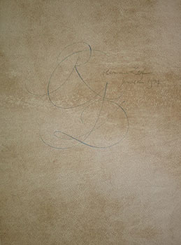
Original Calligraphy by Hermann Zapf for Raymond Gid.
Edité par Jerusalem: 1974, 1974
Vendeur : Wittenborn Art Books, San Francisco, CA, Etats-Unis
Évaluation du vendeur 4 sur 5 étoiles
Manuscrit / Papier ancien Signé
EUR 351,38
Autre deviseEUR 15,35 expédition depuis Etats-Unis vers FranceQuantité disponible : 1 disponible(s)
Ajouter au panierEtat : Good. Original drawing with the initials R.G. for the designer Raymond Gid . Signed and dated. Repaired tear without loss.Hermann Zapf (pronounced ?tsáff,? born November 8, 1918) was a German typeface designer who lived in Darmstadt, Germany and was married to calligrapher and typeface designer Gudrun Zapf von Hesse.Zapf's work, which includes Palatino (1948, named after 16th century Italian writing master Giambattista Palatino) and Optima (1952, a flared sans-serif, released by Stempel in 1958. Zapf disliked its name, which was invented by Stempel's marketers), has been widely copied, often against his will. The best known example may be Monotype's Book Antiqua, which shipped with Microsoft Office and was widely considered a ?knockoff? of Palatino. In 1993, Zapf resigned from ATypI (Association Typographique Internationale) over what he viewed as its hypocritical attitude toward unauthorized copying by prominent ATypI members.In 1935, Zapf attended an exhibition in Nuremberg in honor of the late typographer Rudolf Koch. This exhibition gave him his first interest in lettering. Zapf bought two books there, using them to teach himself calligraphy. He also studied examples of calligraphy in the Nuremberg city library. In 1938, Zapf designed his first printed typeface for D. Stempel AG and Linotype GmbH of Frankfurt, a fraktur type called Gilgengart.In 1976, the Rochester Institute of Technology offered Zapf a professorship in typographic computer programming, the first of its kind in the world. He taught there from 1977 to 1987, flying between Darmstadt and Rochester. There he developed his ideas on digital typography further, with the help of his connections in companies such as IBM and Xerox, and his discussions with the computer specialists at RIT. Zapf used his experience to begin development of a typesetting program called the ?hz-program?, which Adobe Systems acquired and later incorporated in their InDesign program.Expertise by: Dominique COURVOISIER,Expert de la Bibliothčque nationale de France. Membre du Syndicat Français des Experts Professionnels en ?uvres d'art5, rue de Miromesnil 75008 Paris.Provenance: from the estate of Raymond Gid who died Sunday November 12, 2000 in Paris. Born on November 25, 1905, Raymond Gid became first known through his posters, after having studied at les Beaux-Arts. As a film enthusiast, he designed many movie posters, for example Vampyr de Dreyer (photomontage, 1932), Le Silence de la mer by Melville (1949), Les Diaboliques by Clouzot (1955). But a meeting with Guy Levis Mano (editions GLM), editor and typographer, soon directed Gid towards the book. In 1935, he publishes, together with the photographer Pierre Jahan Devot Christ de Perpignan and Chats, Chiens by Ylla. It is an intensive period of his life period: he meets Dufy, Corbusier, Hake, Lurcat and receives the gold medal for a poster at the International exhibition of Paris (1937). He reacts to the Civil War in Spain with a poster " Help to the civil populations ". Together With Father Carre, « bete-a-bon-Dieu » of the Resistance, Raymond Gid began to design liturgical texts. Apocalypse Six (an extract of the biblical text of Saint John) appeard after the war. It is one of his major works, composed in the Peignot typeface, which was designed by Cassandre in 1937. He designs several post-war period posters, for example Week of absent, a simple Lorraine cross surrounded by barbed wire on a dark background. Right from the beginning of the symposiums in Lure (Provence) in 1954, Raymond Gid participates in discussions on typography, particularly with Maximilen Vox, Charles Peignot, Roger Excoffon. Raymond Gid puts on page and illustrates the Dialogues of the Carmelite nuns by Bernanos (1954), then some pages in Caractere Noel 1955, dedicated to his friend Jan van Krimpen, the creator of dutch type faces. He plays with the breathing of the text, in the manner of Mallarme, as in his Book of hours (1959) or his Apocalypse (1964), adapting medieval text to present day tastes. He also designs posters like those for the Club Mediterranee (1961), Bally (1976) or, heavier fare, like that of Amnesty International (1973). During his whole life, Raymond Gid remained attached to the typographical arts. He liked to try out new characters in his compositions, mixing them with his very free drawings, as for example in Messidor published by the Imprimerie nationale (1989). Jean-Francois Porchez, type designer; translated from french by Babelfish and cleaned up a bit. Links Art and Poster Bally posters Chicago Center for the Print Bally posters Poster Auctions International, New York Catalogue from the personal exhibition at the Bibliotheque Forney, Paris, in 1992.
-
In the situation of the artist today there are both analogies to and differences from that of the scientist;. Original broadside signed by Zapf.
Edité par Jerusalem: 1974, 1974
Vendeur : Wittenborn Art Books, San Francisco, CA, Etats-Unis
Évaluation du vendeur 4 sur 5 étoiles
Manuscrit / Papier ancien Signé
EUR 527,07
Autre deviseEUR 15,35 expédition depuis Etats-Unis vers FranceQuantité disponible : 1 disponible(s)
Ajouter au panierEtat : Good. Original letterpress broadside in German with English in smaller font. 61 x 47cm . Signed and dated by Zapf. Presentation copy in Jerusalem to Raymond Gid, signed and dated again. Creases in margins. Discolored in lower margin.Robert Oppenheimer poster designed and signed by Hermann Zapf. Full text below.From: J. R OPPENHEIMER: "PROSPECTS IN THE ARTS AND SCIENCES":"In the situation of the artist today there are both analogies to and differences from that of the scientist; but it is the differences which are the most striking, and which raise the problems that touch most on the evil of our day. For the artist it is not enough that he communicate with others who are expert in his own art. Their fellowship, their understanding, and their appreciation may encourage him; but that is not the end of his work, nor its nature. The artist depends on a common sensibility and culture, on a common meaning of symbols, on a community of experience and common ways of describing and interpreting it. He need not write for everyone or paint or play for everyone. But his audience must be man; it must be man, and not a specialized set of experts among his fellows. Today that is very difficult. Often the artist has an aching sense of great loneliness, for the community to which he addresses himself is largely not there; the traditions and the culture, the symbols and the history, the myths and the common experience, which it is his function to illuminate, to harmonize, and to portray, have been dissolved in a changing world."Hermann Zapf (pronounced ?tsáff,? born November 8, 1918) was a German typeface designer who lived in Darmstadt, Germany and was married to calligrapher and typeface designer Gudrun Zapf von Hesse.Zapf's work, which includes Palatino (1948, named after 16th century Italian writing master Giambattista Palatino) and Optima (1952, a flared sans-serif, released by Stempel in 1958. Zapf disliked its name, which was invented by Stempel's marketers), has been widely copied, often against his will. The best known example may be Monotype's Book Antiqua, which shipped with Microsoft Office and was widely considered a ?knockoff? of Palatino. In 1993, Zapf resigned from ATypI (Association Typographique Internationale) over what he viewed as its hypocritical attitude toward unauthorized copying by prominent ATypI members.In 1935, Zapf attended an exhibition in Nuremberg in honor of the late typographer Rudolf Koch. This exhibition gave him his first interest in lettering. Zapf bought two books there, using them to teach himself calligraphy. He also studied examples of calligraphy in the Nuremberg city library. In 1938, Zapf designed his first printed typeface for D. Stempel AG and Linotype GmbH of Frankfurt, a fraktur type called Gilgengart.In 1976, the Rochester Institute of Technology offered Zapf a professorship in typographic computer programming, the first of its kind in the world. He taught there from 1977 to 1987, flying between Darmstadt and Rochester. There he developed his ideas on digital typography further, with the help of his connections in companies such as IBM and Xerox, and his discussions with the computer specialists at RIT. Zapf used his experience to begin development of a typesetting program called the ?hz-program?, which Adobe Systems acquired and later incorporated in their InDesign program.Expertise by: Dominique COURVOISIER,Expert de la Bibliothčque nationale de France. Membre du Syndicat Français des Experts Professionnels en ?uvres d'art5, rue de Miromesnil 75008 Paris.Provenance: from the estate of Raymond Gid who died Sunday November 12, 2000 in Paris. Born on November 25, 1905, Raymond Gid became first known through his posters, after having studied at les Beaux-Arts. As a film enthusiast, he designed many movie posters, for example Vampyr de Dreyer (photomontage, 1932), Le Silence de la mer by Melville (1949), Les Diaboliques by Clouzot (1955). But a meeting with Guy Levis Mano (editions GLM), editor and typographer, soon directed Gid towards the book. In 1935, he publishes, together with the photographer Pierre Jahan Devot Christ de Perpignan and Chats, Chiens by Ylla. It is an intensive period of his life period: he meets Dufy, Corbusier, Hake, Lurcat and receives the gold medal for a poster at the International exhibition of Paris (1937). He reacts to the Civil War in Spain with a poster " Help to the civil populations ". Together With Father Carre, « bete-a-bon-Dieu » of the Resistance, Raymond Gid began to design liturgical texts. Apocalypse Six (an extract of the biblical text of Saint John) appeard after the war. It is one of his major works, composed in the Peignot typeface, which was designed by Cassandre in 1937. He designs several post-war period posters, for example Week of absent, a simple Lorraine cross surrounded by barbed wire on a dark background. Right from the beginning of the symposiums in Lure (Provence) in 1954, Raymond Gid participates in discussions on typography, particularly with Maximilen Vox, Charles Peignot, Roger Excoffon. Raymond Gid puts on page and illustrates the Dialogues of the Carmelite nuns by Bernanos (1954), then some pages in Caractere Noel 1955, dedicated to his friend Jan van Krimpen, the creator of dutch type faces. He plays with the breathing of the text, in the manner of Mallarme, as in his Book of hours (1959) or his Apocalypse (1964), adapting medieval text to present day tastes. He also designs posters like those for the Club Mediterranee (1961), Bally (1976) or, heavier fare, like that of Amnesty International (1973). During his whole life, Raymond Gid remained attached to the typographical arts. He liked to try out new characters in his compositions, mixing them with his very free drawings, as for example in Messidor published by the Imprimerie nationale (1989). Jean-Francois Porchez, type designer; translated from french by Babelfish and cleaned up a bit. Links Art and Poster Bally posters Chicago Center for the Print B.